Sunday, January 24, 2016

Organizing and Displaying Magazines and Books With Style


Are you a magazine addict? I think I might be. 


As I write this, I have stacks and stacks of magazines sitting on the floor behind me. I may actually have a bit of a magazine hoarding issue. 

I also have a lot of books thanks to a life-long reading habit. 

In spite of all the digital wonder out there, I still like to read real, hard-copy books and magazines. 


While I have reluctantly entered the 21st century at last by subscribing to a couple of magazines in digital format (which I love, by the way), I know will continue to buy the occasional hard copy magazine. The same goes for books.....


I suspect I will purchase some books in digital format; but I also know that hard-copy books are still in my future.


That leaves me with the problem of how to deal with the stacks of magazines that I can't part with, all of my books, and any new additions in a manner that looks neat and tidy and pretty and display-worthy.

I have three answers for this challenge:

  • Selectively contain 
  • Balance color with neutral
  • Balance decorative vignettes with organization 
Using all the cookbooks, home decor and DIY books, and magazines that live in my recently reinvented Ikea bookcase (click here to read more about this project), I'll show you how I did this in this 'working' bookcase.
Contain 

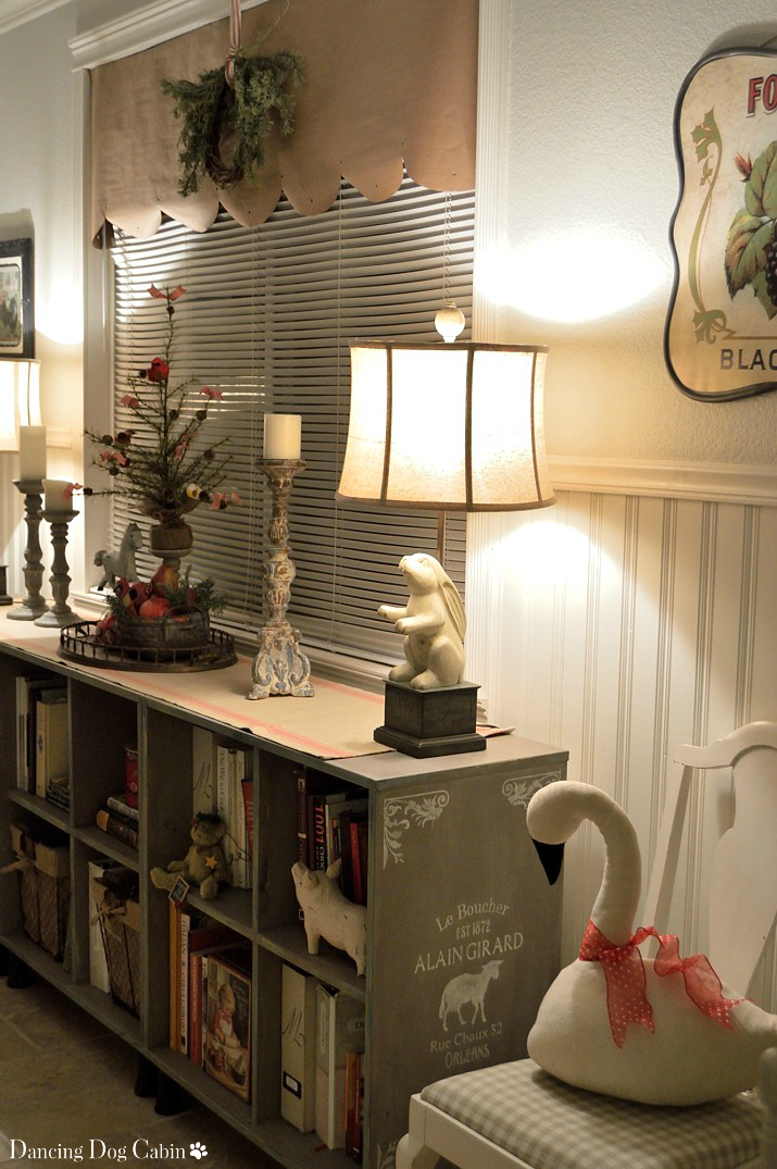
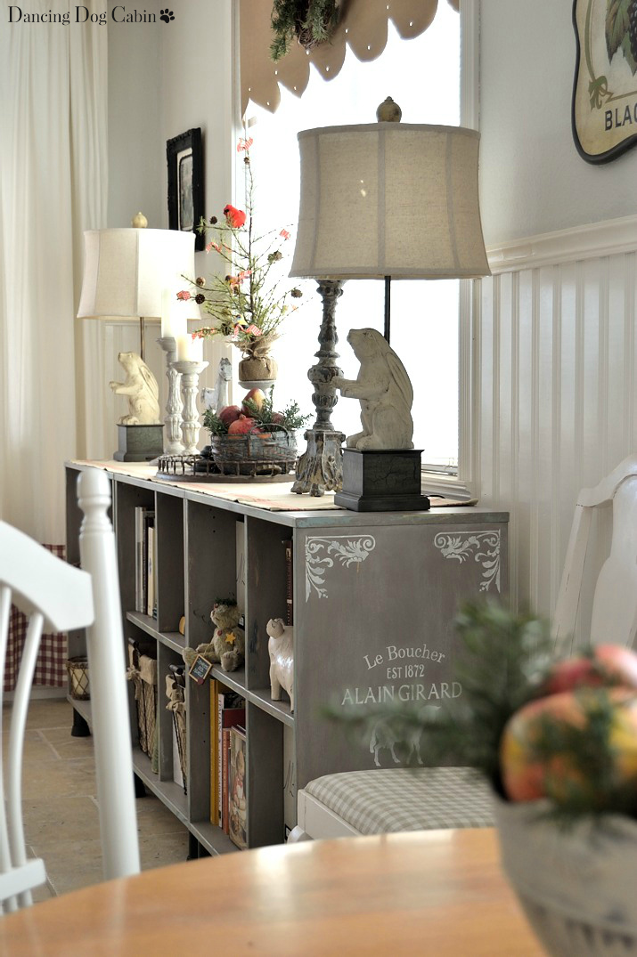
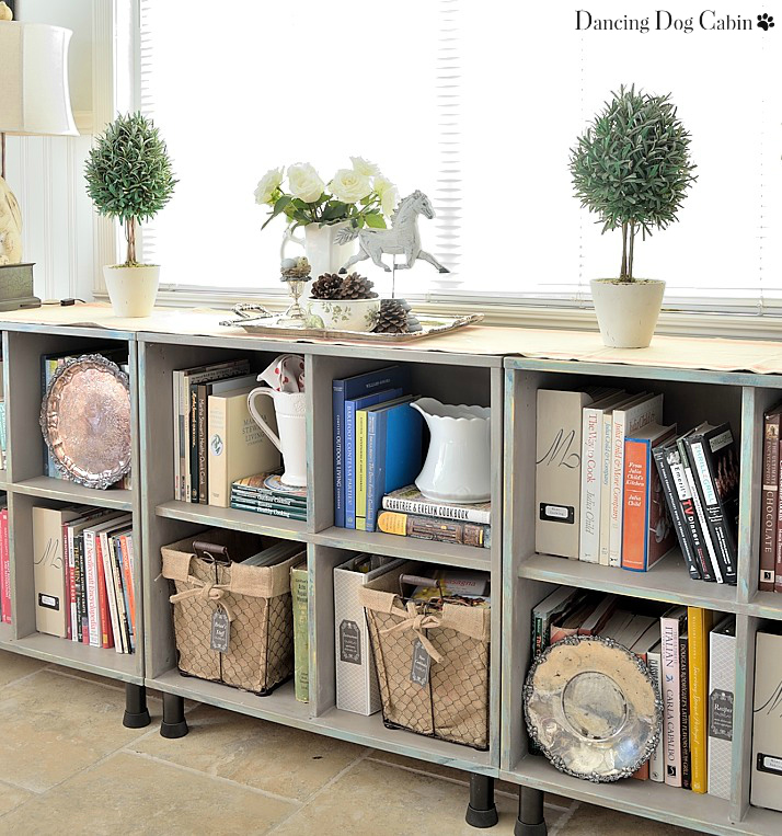
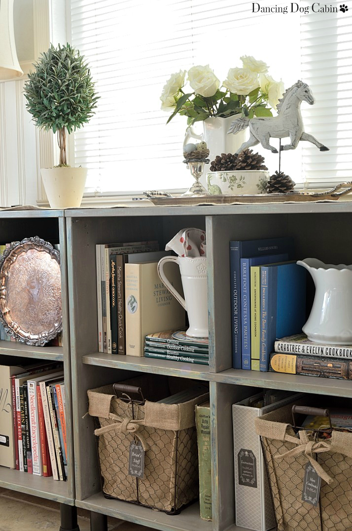
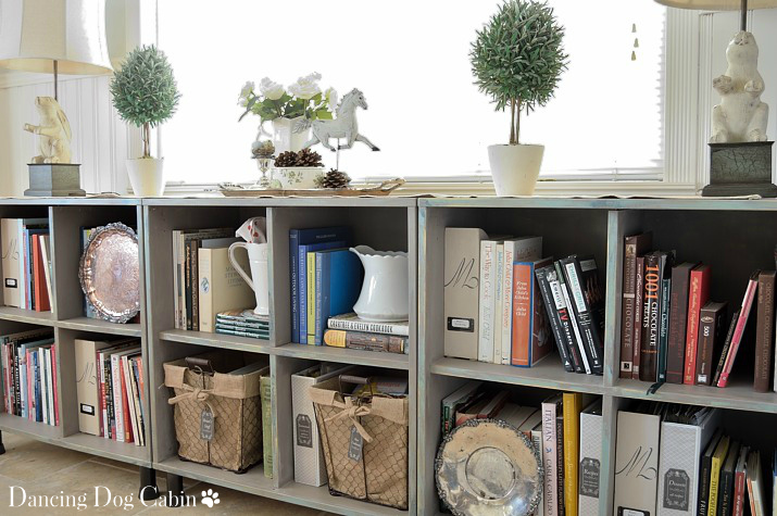
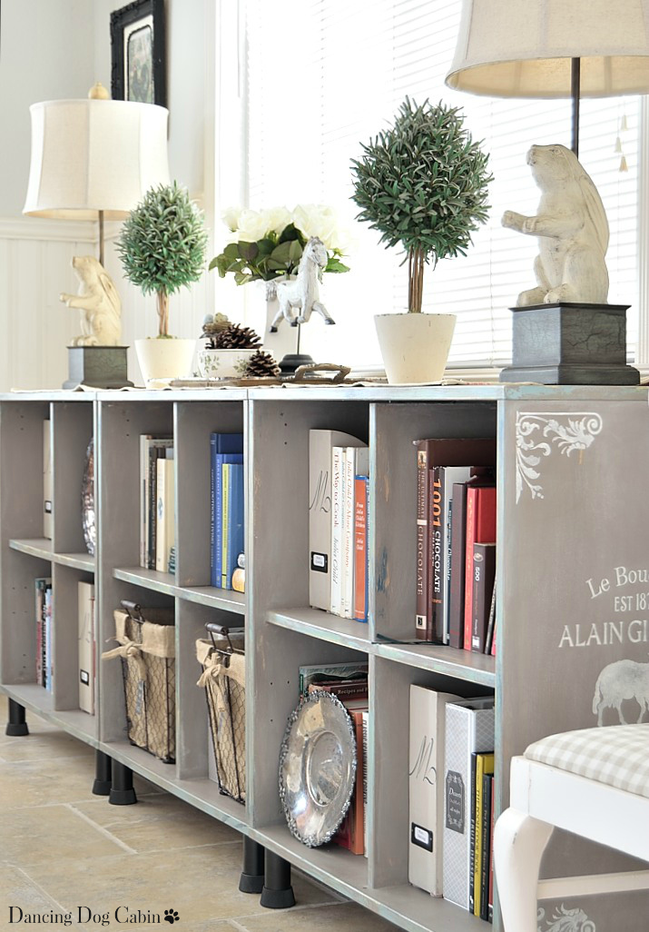
Storing magazines, paperback books, recipes, and other necessary paper items in a bookcase can result in visual clutter. The best way to control this is to use containers and bins to store everything you don't want to see.

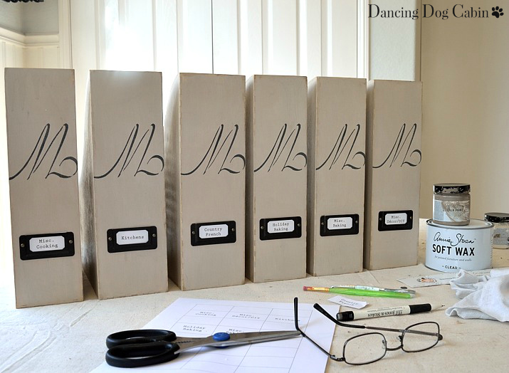
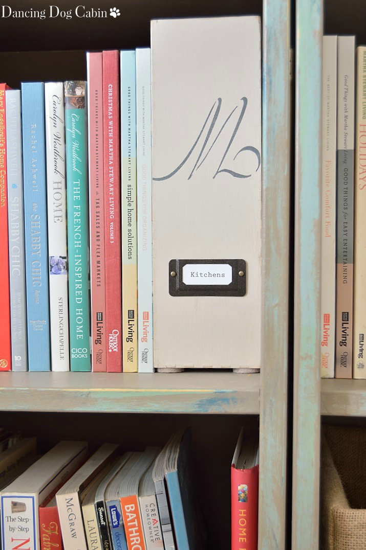
Labeled magazine holders are a good choice for containing, organizing, and hiding magazines. But nice magazine holders get expensive, especially when you are buying them in multiples. And for my project here, I didn't want to spend the next 6 months hunting for the perfect magazine holder that complemented my newly made-over bookcase.

Final answer? Customizing the inexpensive, unfinished magazine holders available at Ikea (at about $9 per a package of two). Note this is not a sponsored post.

The photo collage below provides a quick overview of how I did this. 


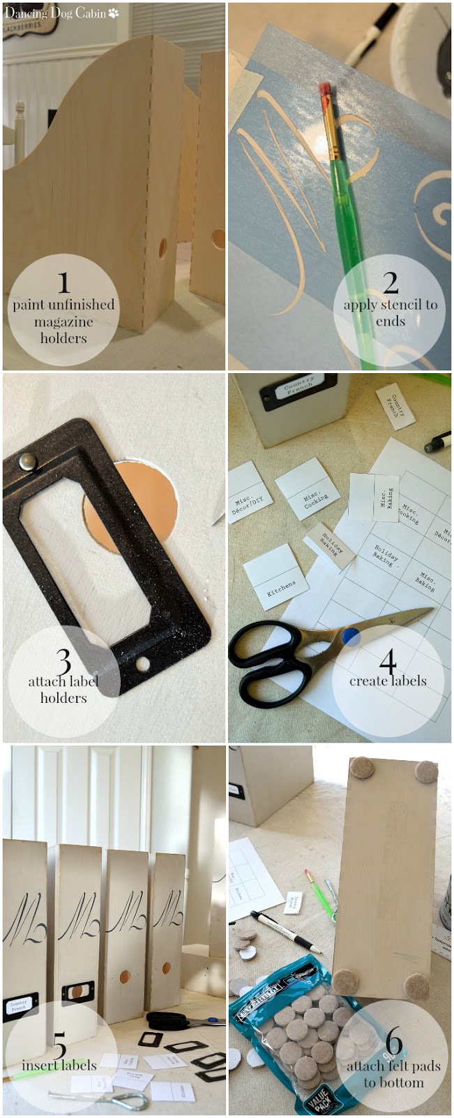
A few things of note....
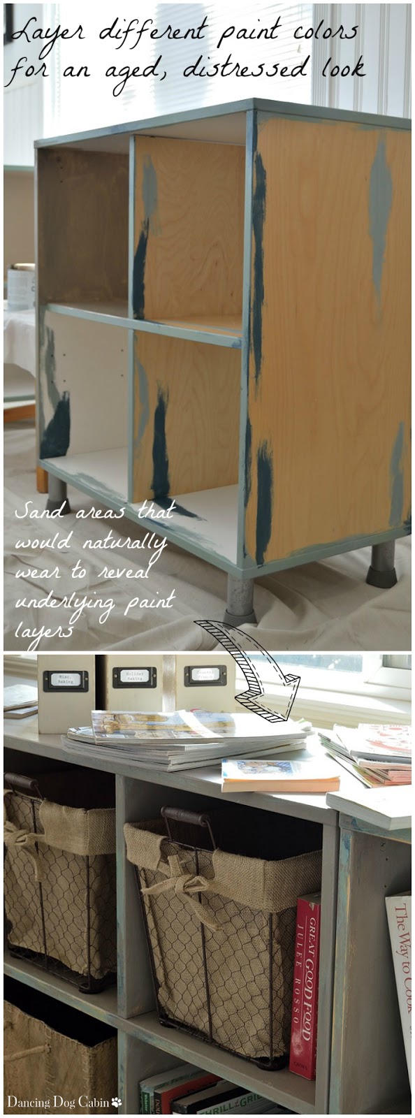
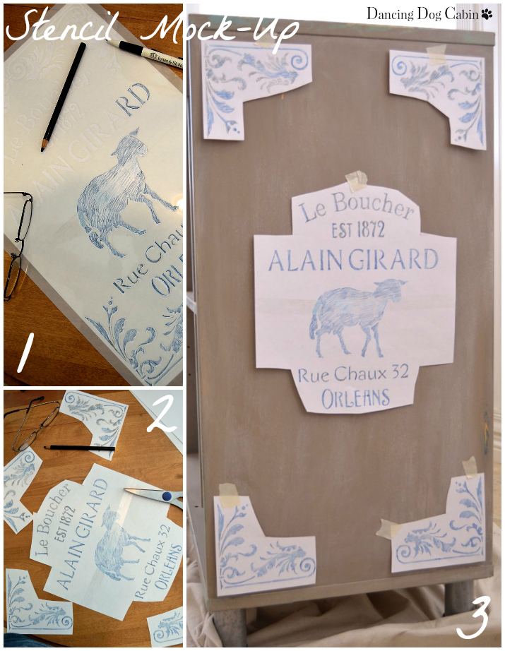
  • I used Annie Sloan paint and clear wax, including 'Coco' lightened with 'Old White' for the overall color and 'Graphite' lightened with 'Old White' for the stencil pattern 
  • I created the labels in Word by using a table of even grids, each at a size that would fit into the label holders. The grid lines provided a guideline for cutting out each label. Creating double-layer labels by folding in half (see No. 4 above) keeps the label from sliding around once inserted into the label holder. 
  • I used the felt pads on the bottom of each holder to protect the bookcase. 


I kept the finished look of the magazine holders simple and neutral so that they complement their colorful book neighbors (more on this below). I also chose to have the tall side of each holder facing outward so that the magazines are hidden.


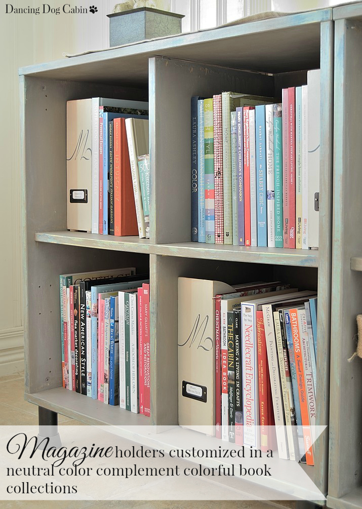
Other residents of this bookcase that I don't want in plain sight include lots of recipes either hand-written, typed, or torn out from a magazine (I can't be bothered to type or scan recipes into a software organization program), and all the instructions for our appliances, electronics, etc..

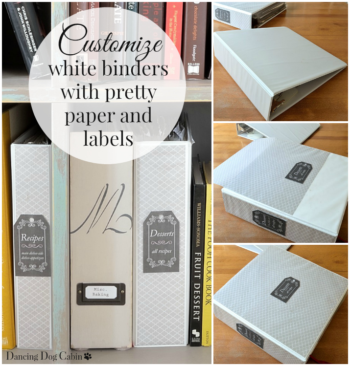
Binders are perfect for organizing this kind of thing. Using the inexpensive white plastic binders you can get at any office supply is another opportunity for customizing. 

Just cut out some pretty paper to fit (I used scrap booking paper), slide under the clear plastic cover, and add a decorative label. I used Avery labels and their free online label design program---very nifty!


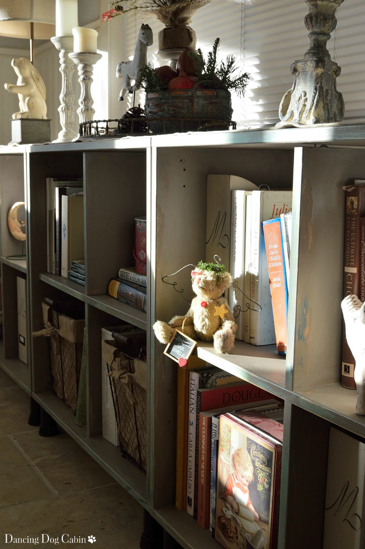
I threw all of our small paperback cookbooks into a couple of bins. With the huge selection of storage bins and boxes out there, it's so easy to find something that suits your purpose and style. 

I chose these rustic, chicken wire and burlap bins because they fit in beautifully with the French Country-style of the bookcase. Again, using labels helps to keep track of everything.


Balance Color With Neutral


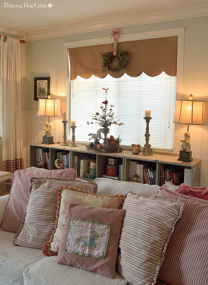
The organizational items, the magazine holders, binders, and chicken-wire bins, are in soft, buff and putty colors and rustic materials that complement the color and style of the bookcase and balance the varied book colors.


The silver trays and white ceramic vases also act as neutrals that are a good foil for the busy-ness of all the books. The round, gleaming trays juxtapose nicely with the vertical lines of the books and help to break up the extended blocks of books in each cubby. 


I read somewhere that you should cover all of your books with matching dust covers for a more cohesive look. That's never going to happen in my house, I just don't have that much spare time or patience. However, I do like to remove the dustcovers that come with most books since often the colors of the book covers underneath are a softer, pretty color.


Balance Decor With Organization


There are some standard recomendations out there for how to approach bookshelf decor. One of them is to create visually interesting vignettes by stacking books. This is a great idea and I love this look, but this approach isn't practical here.....

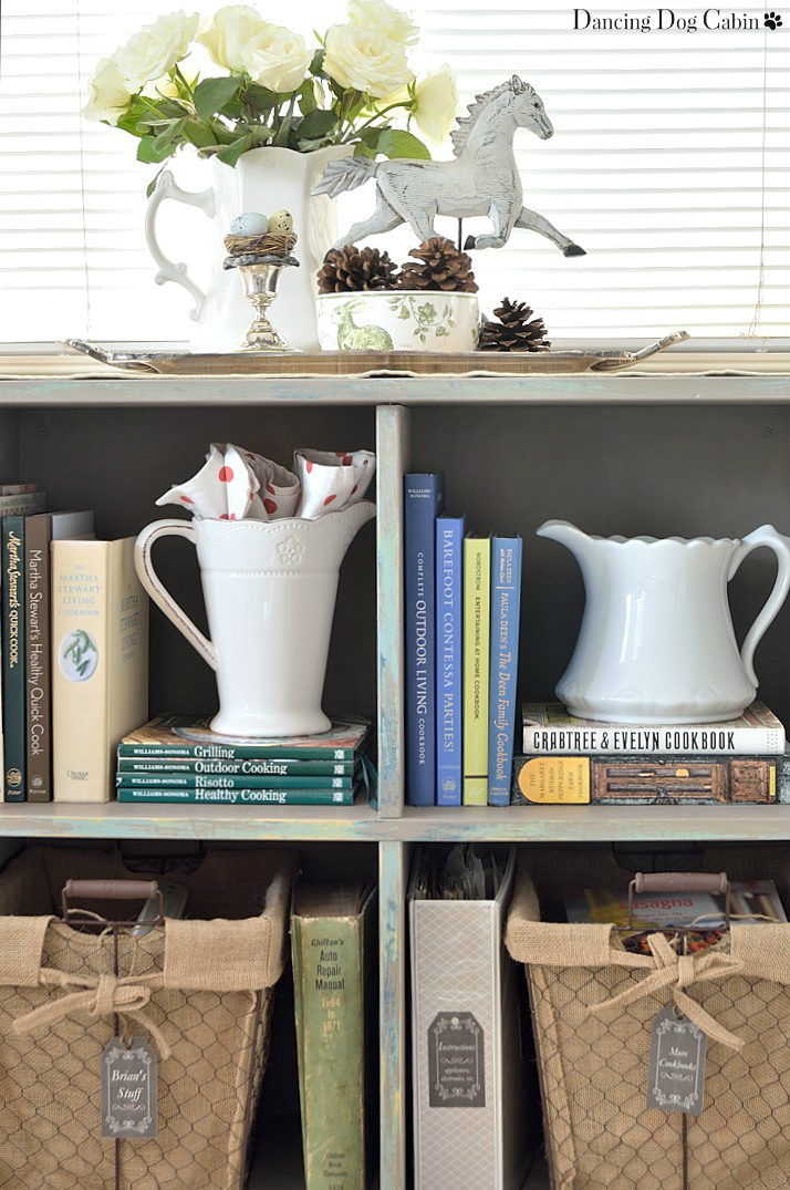
I stacked a couple books that are used infrequently, but in general, stored most of the books vertically. Stacking books that are used all the time just doesn't work here in this 'working' bookcase. Having to extract, for instance, a much-used grilling cookbook from the bottom of a big stack of books would not be viewed with much favor in my household.


Another piece of bookshelf-advise that went out the window is to organize books by color. Again, this is impractical for this collection of books since I don't want to go on a hunting expedition every time I need a particular cookbook. 

Instead, I group each book by subject or author and locate everything according to its purpose. For instance, all my chocolate baking books are in the top right cubby closest to the kitchen (for obvious reasons; anything concerning chocolate should always be readily accessible), all other baking cookbooks are in the cubby below; to the left Martha Stewart shares a cubby with Williams Sonoma and Julia Child shares another cubby with Emeril and assorted hearty- fare cookbooks (I'm sure she wouldn't mind); and decorating books are located the furthest from the kitchen at the far left end.

Although, I will say, I did try to arrange the books within each category in pleasing color combinations as much as possible.


Essentially you need to decide if you are storing and organizing a library that you use all the time....


....or if you are creating a decorative display that features attractive books (not that libraries can't be attractive and visually pleasing)....  

Obviously, it can be a little of both.  The ratio of display to practical storage and organization depends entirely on your particular needs and ultimate goals.


Thanks for visiting!


***

Linking to the following this week....
Roses of Inspiration Linkup at The Enchanting Rose
Bouquet of Talent at Life on Lakeshore Drive
Brag-Worthy at Bless'er House
Show and Tell Friday at My Romantic Home
Inspiration Thursday at In The New House Designs
Five Star Frou-Frou at a Tray of Bliss
Share It One More Time at DesignThusiasm

I was featured at....

Share It Link Party Featured Button

Sunday, January 10, 2016

How to Transform an Ikea Bookcase


Once, thanks to an article in Martha Stewart Living, I was convinced that I would buy nothing but Heywood-Wakefield furniture and fill my home with a carefully curated collection of this fine example of Mid-Century Modern furniture from the 1940s and 1950s.   At that time, my approach to decorating leaned very much in the direction of a more contemporary style.


I quickly discovered that Heywood-Wakefield furniture was (a) hard to find (this was long before the Internet, EBay, Craigslist, etc.) and (b) very expensive. This was back when Shabby Chic had first become so hugely popular and it was very difficult to find furniture retailers that carried anything that looked like Mid-Century Modern, except for Ikea. It goes without saying that Ikea was, and is, a great resource for very reasonably priced furniture with a contemporary/modern (especially Swedish Modern) vibe. So, in my early decorating days, I bought a lot of stuff from Ikea.

Back then, I would have been thrilled with today's Mid-Century Modern, Urban-Contemporary, etc. trends. Now, not so much. My decorating style has made a 180-degree turn and is now firmly Traditional-Country French-English Country-Cottage, with regular excursions into Rustic Cabin Chic (for wont of a better term) territory thanks to our cabin project. 

Funny how one's style evolves, huh?


I still have a few lingering Ikea pieces that I haven't gotten around to replacing, one of which includes this bookcase that I have been using to house all of our cook books, and my home decor, crafting, and DIY books. 

There is so much that I still love about this bookcase.... 

I love that it is actually three separate units that can be pushed together to form one long, low unit that functions as both a bookcase and a display console. 

I love that each unit has four deep cubbies that can accommodate large books, serving ware, or anything else I want to display. 

I do not love, however, its blond laminate wood and melamine finish, and its obvious Ikea origin.


I had toyed with the idea of replicating the bookcase in a more rustic pine plywood (or perhaps in salvaged palate wood) and then giving it a more Country French treatment. 

However, after all the recent hard labor on our cabin, I decided neither me or my husband were up to building three pieces of furniture from scratch, and that the better course of action would be to re-purpose the 'bookcase' and turn it into a cross between Vintage Industrial and my idea of old, distressed Country French utilitarian. 

So.... here is my Ikea transformation project. 

***

Here are the supplies that I used: 

1. Annie Sloan chalk paint (click here for the official website) including underlying color layers (Aubusson Blue, Antibes Green, Duck Egg, Provence); final overall color (Coco); and finishing wash (Old White diluted with water)

2. Annie Sloan clear wax

3. Decorative stencil (also Annie Sloan)

4. Rust-Oleum Oil Rubbed Bronze spray pain

5. Paint brushes (including stencil brushes), fine and extra- fine sandpaper, colored pencil, regular pencil, scissors, lint-free cloths. 

And here is how I did it...


Aging and Distressing

1. I painted a random mix of Aubusson Blue, Antibes Green, Duck Egg, Provence on the bookcase edges and other potential wear areas

2. I applied wax to all areas where I wanted the paint to show through (this allows the final coat to be easily sanded away, but protects the underlying paint colors)

3. I painted all surfaces with Coco

4. I applied a wash of approximately 50/50 Old White and water to all painted surfaces and then rubbed off most of it with a soft, lint-free cloth

5. I sanded all edges and corners using a medium grit sandpaper to remove some of the Coco and reveal the underlying paint colors


According to the Annie Sloan painting instructions, I did not sand or prime the bookcase prior to painting. As I note above, the bookcase consisted of a high gloss, maple laminate finish on most of the surfaces, with a melamine surface on the cubby interior.

Once I got into the project I found that I should have ignored this advice and sanded/primed the bookcase, since the paint, even after fully dried, scrapes of very easily from these very slick surfaces.


Stenciling

Once finished with the paint layers and distressing, it was time to move on to stenciling. I went with this vintage French sign pattern to take the bookcase from old Ikea to re-purposed vintage French butcher-shop ('Le Boucher') storage cabinets.

I wanted the stencil pattern to fill the entire side of the bookcase and to do that, I had to adjust the stencil position as I stenciled the pattern. But before I actually started stenciling, I mocked up the pattern placement first to confirm that I would like the end result. Here is how I did that:

1. I used a colored pencil to transfer the stencil pattern to a piece of paper.

2. I cut out each of the patterns

3. I taped each colored pattern piece to the side of the bookcase and adjusted until I liked the pattern placement


Once I was happy with the pattern placement, I stenciled the pattern to the side of the bookcase using a stencil brush and Old White paint.

After the paint dried, I sanded the pattern lightly with a fine grit sandpaper to give it an old, distressed look.


Finishing Touches ('new' feet)

Lastly, I needed to do something about the feet. I thought about replacing the existing feet with wheels, but decided to take the easier and cheaper route and just spray paint the existing feet with Rust-Oleum Oil Rubbed Bronze.


Re-capping what I started with and where I ended up, here are before-and-after photos......


***

Recent Christmas joy on the 'new' bookcase-- this is why I wanted to get this bookcase transformed. It's so much more fun to decorate now!


Another benefit of a bookcase composed of three separate units that are interchangeable is that I could apply a different stencil pattern on the sides of each unit, and then switch them around for an entirely different look on each end.

I say I 'could'. I haven't done it yet....but I may tackle this additional refinement at some point in the future.


***

The main lesson learned here is that if the piece of furniture has a very high gloss finish, you do need to sand and/or prime the surface before painting with chalk paint, otherwise the paint comes off at the drop of a hat. I have found, however, that furniture with a low- or no-gloss finish, does just fine without sanding or priming prior to applying chalk paint.


And, before I sign off, here is a sneak peek at a future companion post to this one: customizing unfinished Ikea magazine holders to contain all the decor, cooking, and baking magazines that live in this bookcase......


Thanks for visiting!


***

Linking to the following this week....
Roses of Inspiration Linkup at The Enchanting Rose
Bouquet of Talent at Life on Lakeshore Drive
Brag-Worthy at Bless'er House
Show and Tell Friday at My Romantic Home
Inspiration Thursday at In The New House Designs
Five Star Frou-Frou at a Tray of Bliss

I was featured at....


Share It Link Party Featured Button


Friday, January 1, 2016

Happy New Year 2016! - Top Ten Posts of 2015


I know everyone says this on every New Years Day, but...this year has truly flown by.  It seems like it was just yesterday that I was sitting in front of my computer wondering what my first post of 2015 should be.

As a celebration my 2015 blogging adventures and all the wonderful support and feedback that I've received from all of you who follow along, I'm re-capping the top ten Dancing Dog Cabin posts of 2015.


Starting with No. 10 and ending with No. 1, please click through the title of each post to read the entire article.


No. 10


No. 9


No. 8


No. 7


No. 6


No. 5


No. 4.


No. 3


No. 1


***

Why stop at ten?  Here are a couple of personal favorites that I'm including in no particular order.


***

Editorial Update: Not sure if this is a blogging no-no or not, but I had intended to include this sneak peek at my next post, which involves transforming a tired old Ikea bookcase.


***

For everyone who reads Dancing Dog Cabin, thank you so much for following along and leaving such kind and lovely comments!  Thank you to all the linky-hosts who have featured my various posts and projects and to anyone who has pinned and shared my posts.  This is what makes blogging so fun and rewarding.

Wishing everyone a wonderful and happy New Year!!

***

Linking to the following this week....
Roses of Inspiration Linkup at The Enchanting Rose
Bouquet of Talent at Life on Lakeshore Drive
Brag-Worthy at Bless'er House
Inspiration Thursday at In The New House Designs
Five Star Frou-Frou at a Tray of Bliss
Something to Talk About at Karen's Up On The Hill
Share It One More Time at DesignThusiasm