Showing posts with label Books. Show all posts

Sunday, March 6, 2016

Spring Mantlescape: The Anatomy of a Vignette


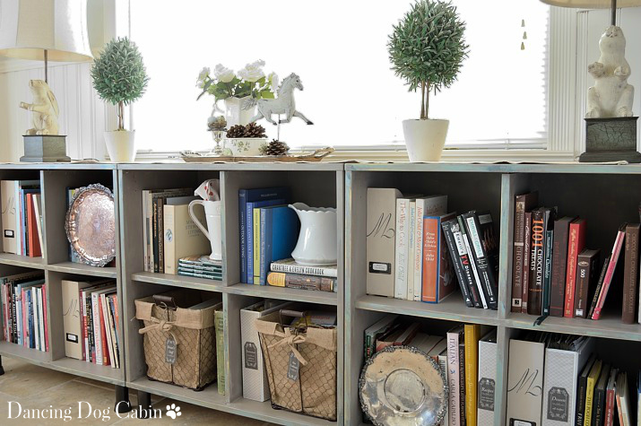
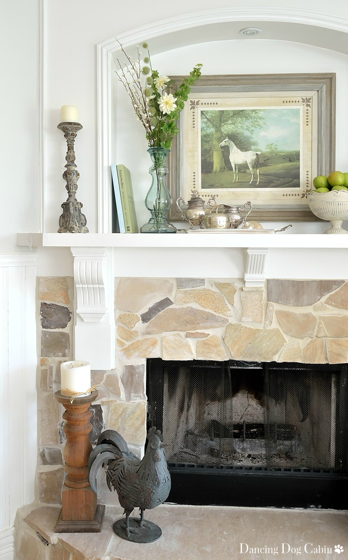
Sometimes I throw together vignettes I'm happy with in no time flat, sometimes I struggle, and arrange and re-arrange and never seem to get it right.

My spring mantlescape came together fairly quickly, and I'm pretty happy with it, so I thought I would present it as a kind of 'anatomy' lesson.


Here is my take on the important elements of a good vignette, which is generally composed of a pleasing balance of variable and repeated elements and motifs.


Shape


Striking the right balance between 'skinny' and 'fat' objects and groups makes all the difference. The 'fat' shapes of the horse picture, metal pedestal bowl full of apples, and collection of silver objects juxtapose nicely with the 'skinny' shapes of the books, vase, and candle holders.


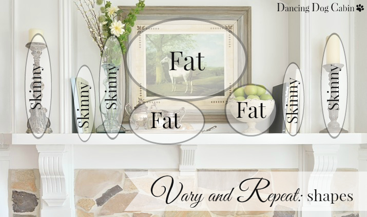
Repetition of these shapes achieves visual balance.


Height


Varying the height of objects is another important way of adding visual interest; repeating objects with the same height, and using a degree of symmetry keeps things balanced and visually satisfying. The two candle holders on either side of the niche are virtually the same size, once I added the taller candle to the shorter one on the right.


This doesn't mean that you couldn't flank this entire arrangement with two objects of differing heights; it all depends on the ultimate look that you are trying to achieve. In general, the more symmetry you add to a vignette, the more formal it becomes. For instance, if I used the exact same candle holder on each side of the niche, and the exact same glass vase and floral arrangement on either side of the horse picture, the whole thing would be much more formal in effect.

Digressing a little from the subject of height, the degree of formality can be adjusted in other ways as well; using multiples of the same shapes, using more silver-plate objects, and eliminating the books and the bowl of fruit, both of which add a fun, spontaneous touch to the whole arrangement, would amp up the formality here.


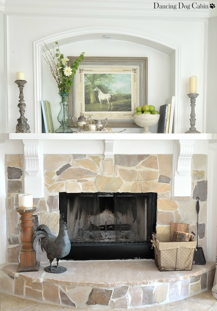
In this case, I didn't want anything too stiff and matchy. Varying tall, medium, and short objects produced a more casual, informal effect (as did using rustic finishes and unexpected objects such as the candle holders, books, and apples).

The glass vase with its collection of florals adds a bit of extra drama to the entire scene, which is needed for this deep, substantial wall niche. 


Pattern


Varying and repeating patterns and motifs is another way of creating a vignette that is interesting and dynamic. The curvy ornateness of the candle holders is repeated again in the equally voluptuous glass vase, but the materials and finishes of each object are different.


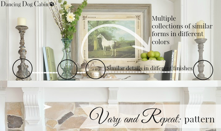
The collection of round, green apples in the white metal bowl echos the adjacent collection of short, squat silver objects.

The apple motif is literally repeated in the brass apple, which, thanks to its silvery finish, matches it's silver-plate companions very nicely.


Color


There are four main colors in this vignette: green, white, putty/gray, and blue. All of these colors are repeated multiple times and can be found in the horse painting, as shown in the diagram below.

Again, it's the variety that makes it interesting, and it's just the right amount of sameness and repetition that keeps it cohesive.


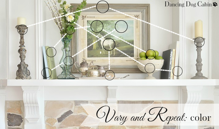
While there are variations of four colors here, they are all on the soft, neutral side of the spectrum, which allows everyone to play nice together. If the Farrow and Ball book on the left was in a bright Kelly-green color instead of it's soft, faded apple green, it would be visually jarring and look out of place.


Texture


There are four main textures here: rough, soft, shiny and gleaming, and natural. Again, the variety makes it interesting, and the repetition pulls it all together.


The shiny glass and gleaming silver creates a focal point that catches the eye and adds an elegant touch, while the aged, nubby finish of the candle holders provide a nice contrast--and, incidentally works well with the rough stone of the fireplace below.


So.... do I go through this very scientific analysis ever time I put together a vignette? No way. It's still a trial and error process where I add and subtract, fiddle and adjust, and then stand back and look-- and then go through the process again and again until I'm happy.....


....but as I adjust, I'm attempting to achieve the right mix of variation and repetition within each of these five categories (i.e. shape, height, pattern, color, and texture). Adjusting symmetry (as well as the finish and type of each object) more or less determines the level of formality.


***


Thanks for visiting!


***

Linking to the following this week....
Roses of Inspiration Linkup at The Enchanting Rose
Show and Tell Friday at My Romantic Home
Inspiration Thursday at In The New House Designs


I was featured at....

309th Inspire Me Tuesday at A Stroll Thru Life

Vintage Charm Party #22 at Charm Bracelet Diva and My Thrift Store Addiction

Charm Bracelet Diva {At Home}


Best of the Weekend at Sweet Pea


Sunday, January 24, 2016

Organizing and Displaying Magazines and Books With Style


Are you a magazine addict? I think I might be. 


As I write this, I have stacks and stacks of magazines sitting on the floor behind me. I may actually have a bit of a magazine hoarding issue. 

I also have a lot of books thanks to a life-long reading habit. 

In spite of all the digital wonder out there, I still like to read real, hard-copy books and magazines. 


While I have reluctantly entered the 21st century at last by subscribing to a couple of magazines in digital format (which I love, by the way), I know will continue to buy the occasional hard copy magazine. The same goes for books.....


I suspect I will purchase some books in digital format; but I also know that hard-copy books are still in my future.


That leaves me with the problem of how to deal with the stacks of magazines that I can't part with, all of my books, and any new additions in a manner that looks neat and tidy and pretty and display-worthy.

I have three answers for this challenge:

  • Selectively contain 
  • Balance color with neutral
  • Balance decorative vignettes with organization 
Using all the cookbooks, home decor and DIY books, and magazines that live in my recently reinvented Ikea bookcase (click here to read more about this project), I'll show you how I did this in this 'working' bookcase.
Contain 

Storing magazines, paperback books, recipes, and other necessary paper items in a bookcase can result in visual clutter. The best way to control this is to use containers and bins to store everything you don't want to see.

Labeled magazine holders are a good choice for containing, organizing, and hiding magazines. But nice magazine holders get expensive, especially when you are buying them in multiples. And for my project here, I didn't want to spend the next 6 months hunting for the perfect magazine holder that complemented my newly made-over bookcase.

Final answer? Customizing the inexpensive, unfinished magazine holders available at Ikea (at about $9 per a package of two). Note this is not a sponsored post.

The photo collage below provides a quick overview of how I did this. 


A few things of note....
  • I used Annie Sloan paint and clear wax, including 'Coco' lightened with 'Old White' for the overall color and 'Graphite' lightened with 'Old White' for the stencil pattern 
  • I created the labels in Word by using a table of even grids, each at a size that would fit into the label holders. The grid lines provided a guideline for cutting out each label. Creating double-layer labels by folding in half (see No. 4 above) keeps the label from sliding around once inserted into the label holder. 
  • I used the felt pads on the bottom of each holder to protect the bookcase. 


I kept the finished look of the magazine holders simple and neutral so that they complement their colorful book neighbors (more on this below). I also chose to have the tall side of each holder facing outward so that the magazines are hidden.


Other residents of this bookcase that I don't want in plain sight include lots of recipes either hand-written, typed, or torn out from a magazine (I can't be bothered to type or scan recipes into a software organization program), and all the instructions for our appliances, electronics, etc..

Binders are perfect for organizing this kind of thing. Using the inexpensive white plastic binders you can get at any office supply is another opportunity for customizing. 

Just cut out some pretty paper to fit (I used scrap booking paper), slide under the clear plastic cover, and add a decorative label. I used Avery labels and their free online label design program---very nifty!


I threw all of our small paperback cookbooks into a couple of bins. With the huge selection of storage bins and boxes out there, it's so easy to find something that suits your purpose and style. 

I chose these rustic, chicken wire and burlap bins because they fit in beautifully with the French Country-style of the bookcase. Again, using labels helps to keep track of everything.


Balance Color With Neutral


The organizational items, the magazine holders, binders, and chicken-wire bins, are in soft, buff and putty colors and rustic materials that complement the color and style of the bookcase and balance the varied book colors.


The silver trays and white ceramic vases also act as neutrals that are a good foil for the busy-ness of all the books. The round, gleaming trays juxtapose nicely with the vertical lines of the books and help to break up the extended blocks of books in each cubby. 


I read somewhere that you should cover all of your books with matching dust covers for a more cohesive look. That's never going to happen in my house, I just don't have that much spare time or patience. However, I do like to remove the dustcovers that come with most books since often the colors of the book covers underneath are a softer, pretty color.


Balance Decor With Organization


There are some standard recomendations out there for how to approach bookshelf decor. One of them is to create visually interesting vignettes by stacking books. This is a great idea and I love this look, but this approach isn't practical here.....

I stacked a couple books that are used infrequently, but in general, stored most of the books vertically. Stacking books that are used all the time just doesn't work here in this 'working' bookcase. Having to extract, for instance, a much-used grilling cookbook from the bottom of a big stack of books would not be viewed with much favor in my household.


Another piece of bookshelf-advise that went out the window is to organize books by color. Again, this is impractical for this collection of books since I don't want to go on a hunting expedition every time I need a particular cookbook. 

Instead, I group each book by subject or author and locate everything according to its purpose. For instance, all my chocolate baking books are in the top right cubby closest to the kitchen (for obvious reasons; anything concerning chocolate should always be readily accessible), all other baking cookbooks are in the cubby below; to the left Martha Stewart shares a cubby with Williams Sonoma and Julia Child shares another cubby with Emeril and assorted hearty- fare cookbooks (I'm sure she wouldn't mind); and decorating books are located the furthest from the kitchen at the far left end.

Although, I will say, I did try to arrange the books within each category in pleasing color combinations as much as possible.


Essentially you need to decide if you are storing and organizing a library that you use all the time....


....or if you are creating a decorative display that features attractive books (not that libraries can't be attractive and visually pleasing)....  

Obviously, it can be a little of both.  The ratio of display to practical storage and organization depends entirely on your particular needs and ultimate goals.


Thanks for visiting!


***

Linking to the following this week....
Roses of Inspiration Linkup at The Enchanting Rose
Bouquet of Talent at Life on Lakeshore Drive
Brag-Worthy at Bless'er House
Show and Tell Friday at My Romantic Home
Inspiration Thursday at In The New House Designs
Five Star Frou-Frou at a Tray of Bliss
Share It One More Time at DesignThusiasm

I was featured at....

Share It Link Party Featured Button