
Until recently, I collected red transferware only. A few years ago, about the same time I decided it might be nice to have some brown transferware for fall, specifically for Thanksgiving, I stumbled upon a fantastic deal in an antique mall-- a huge collection of brown Tonquin Royal Staffordshire transferware drastically marked down. Talk about serendipity. I snapped it up and---voila!---had an instant collection with which to decorate (and eat off of) to my heart's content.
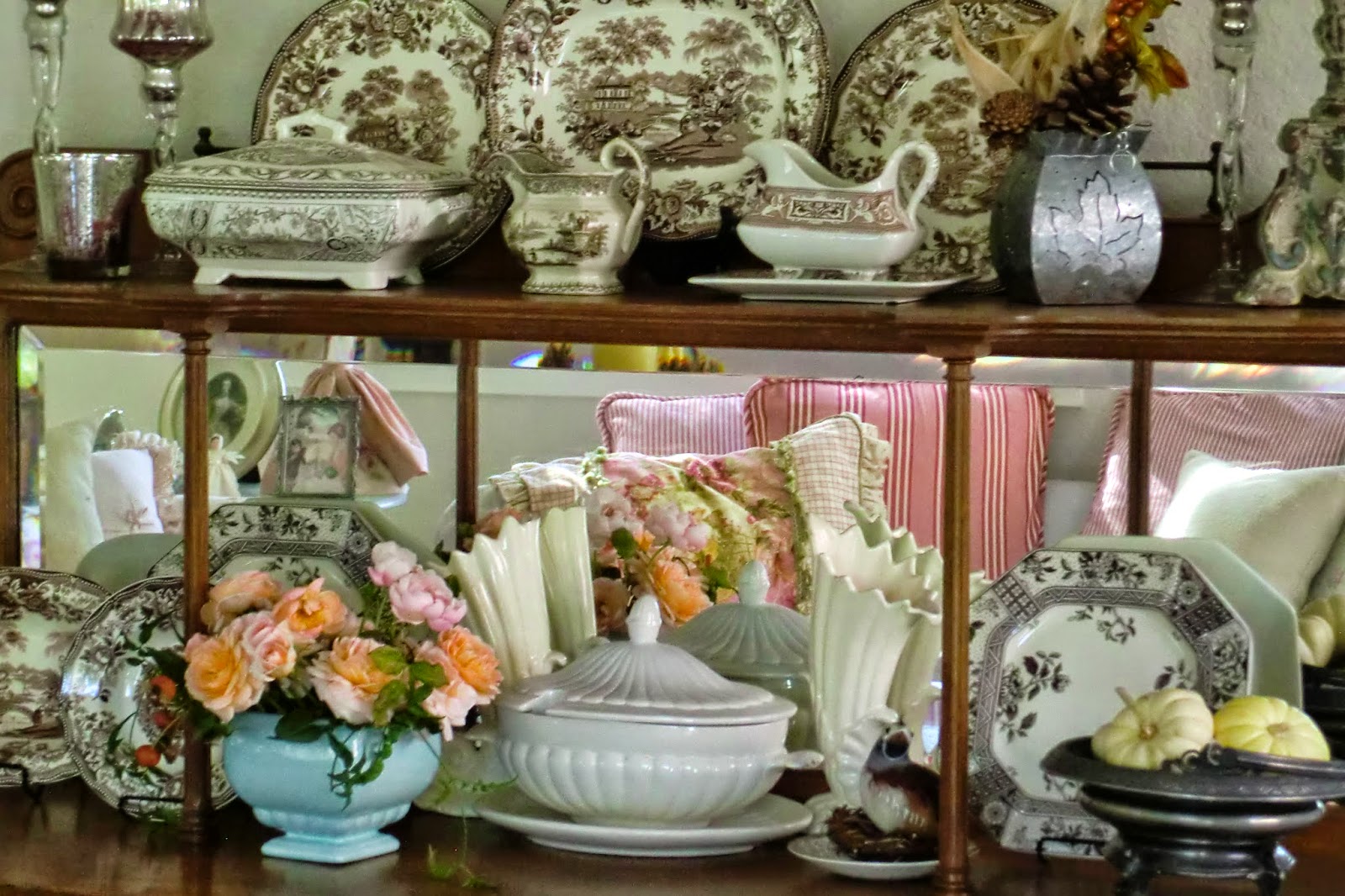
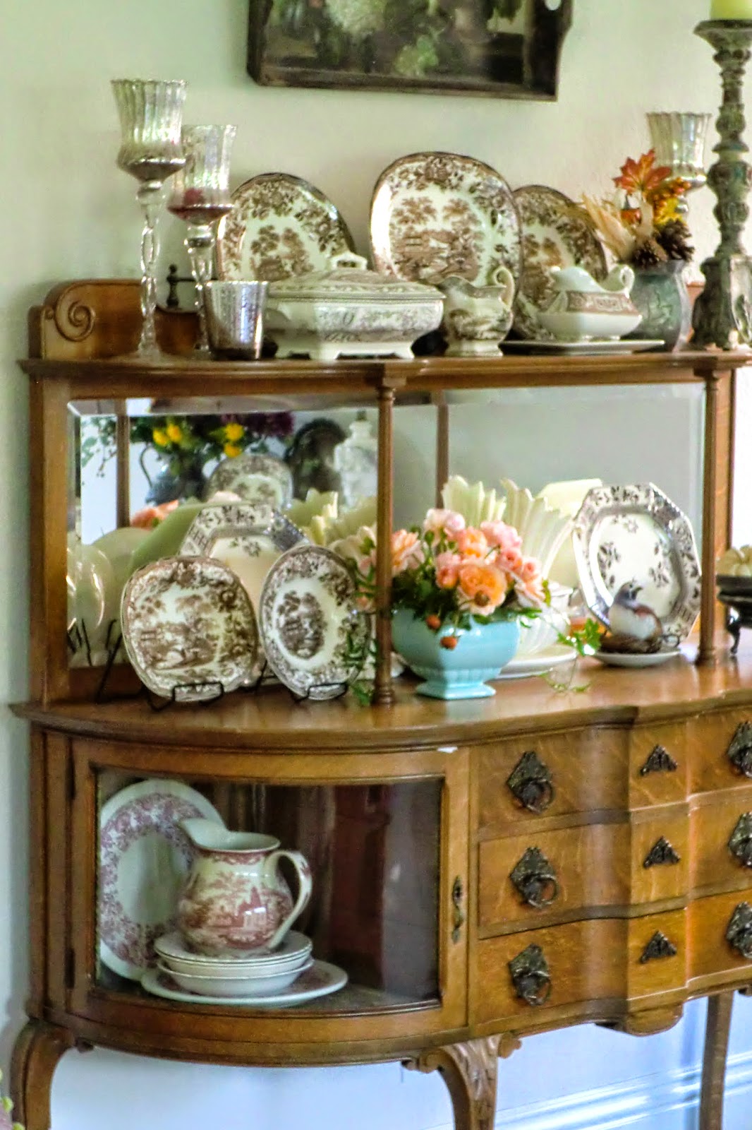
Lots of dinner plates, salad plates, bowls, saucers (no teacups), a few serving pieces-- mixed in here with other non-Tonquin pieces.

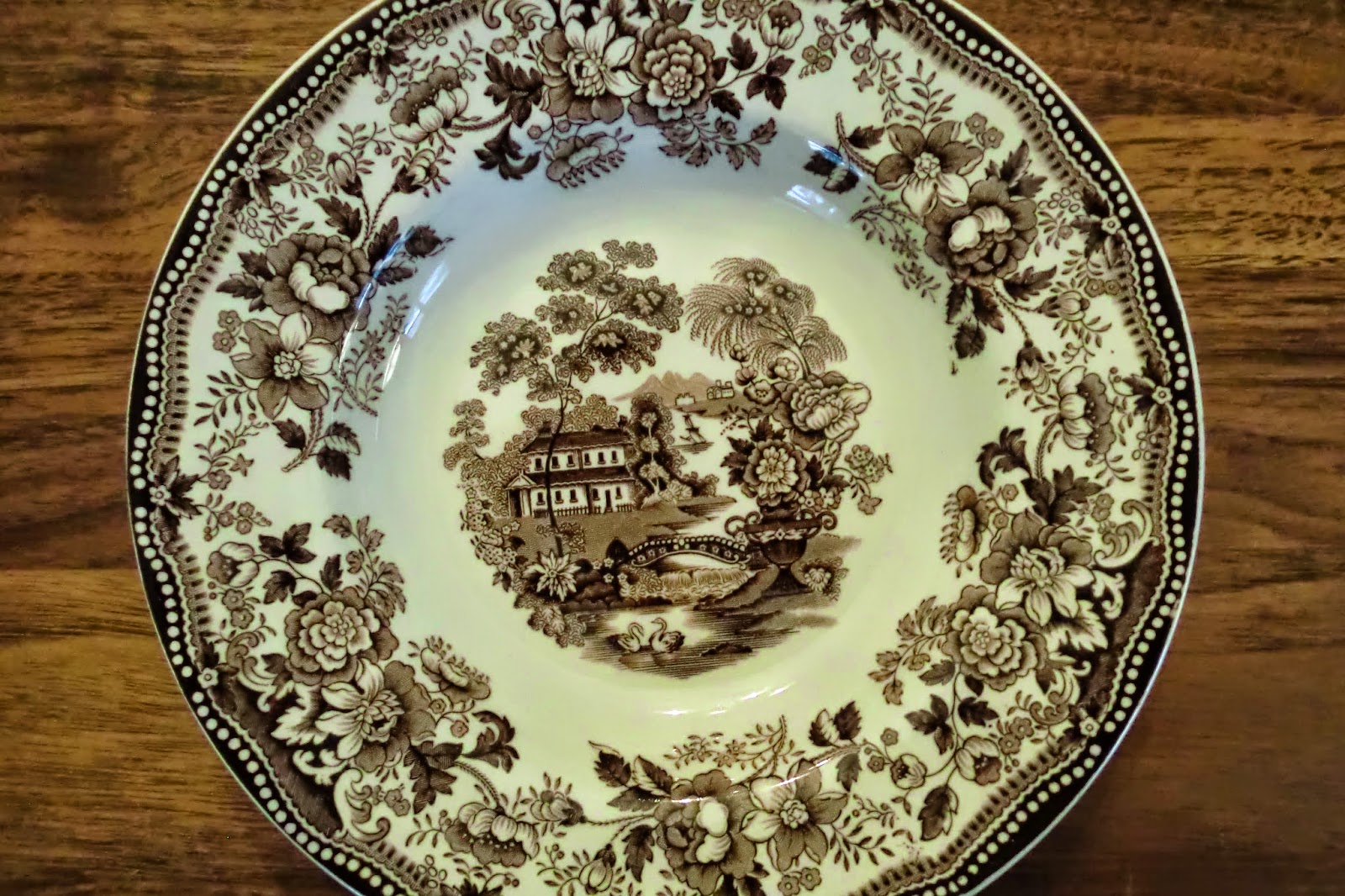
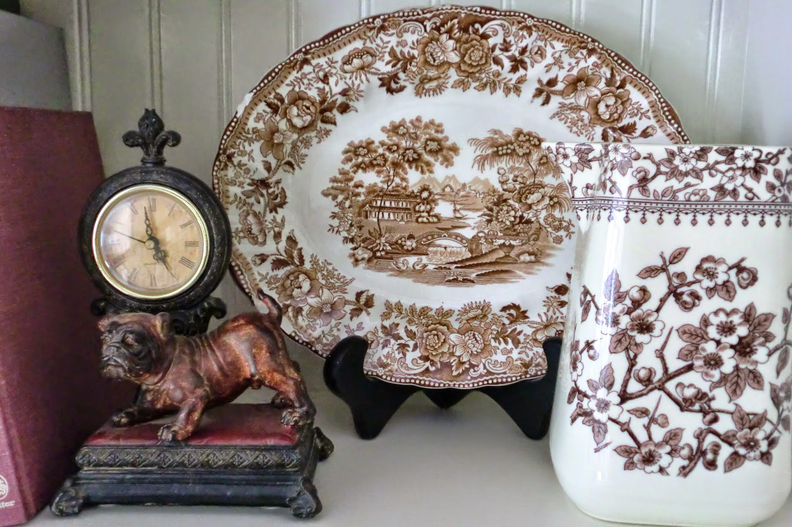
Here is a close up of the pattern-- 'Tonquin'. This is exactly the same pattern as my favorite red transferware collection. Depictions of Chinese scenes are common in transferware, since the 'transferware' process was a method used in the 18th and 19th centuries to economically mass-produce inexpensive ceramics that emulated the very costly hand-painted porcelain being imported from China at that time.
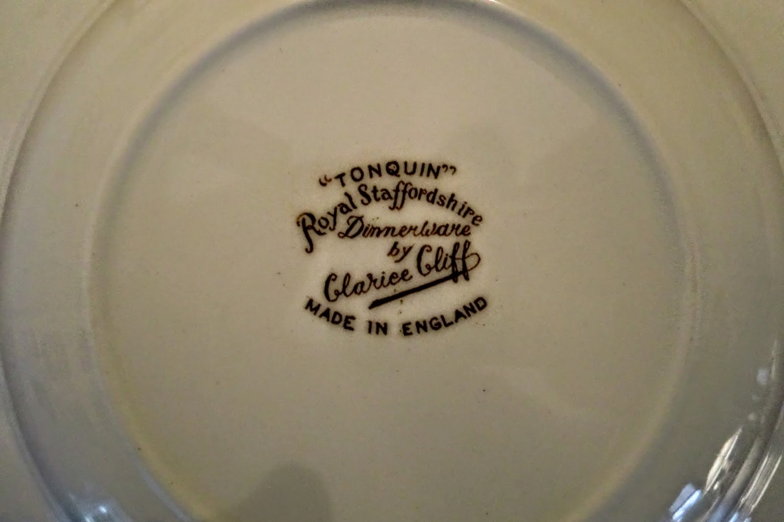
Here is the mark. Did a little research and found that these are one of the many patterns created by Clarice Cliff when she designed pottery for the Royal Staffordshire pottery factory in England after the 1920s.
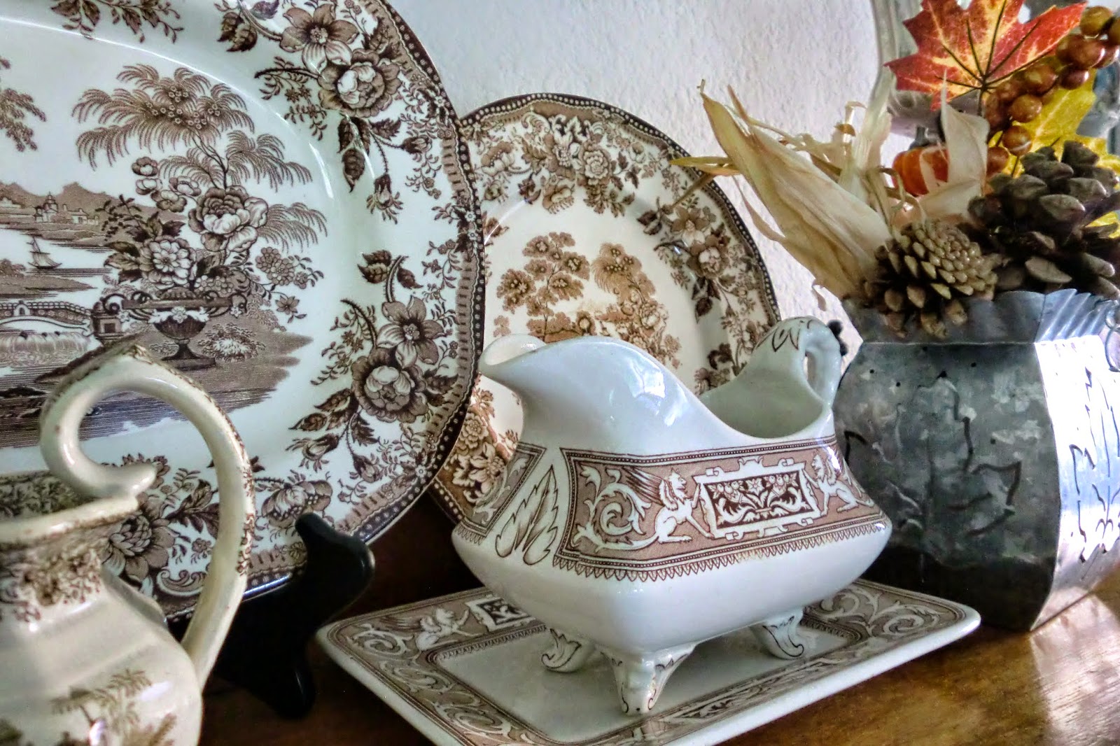
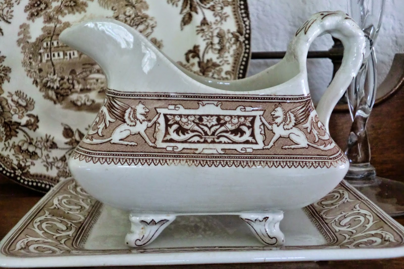
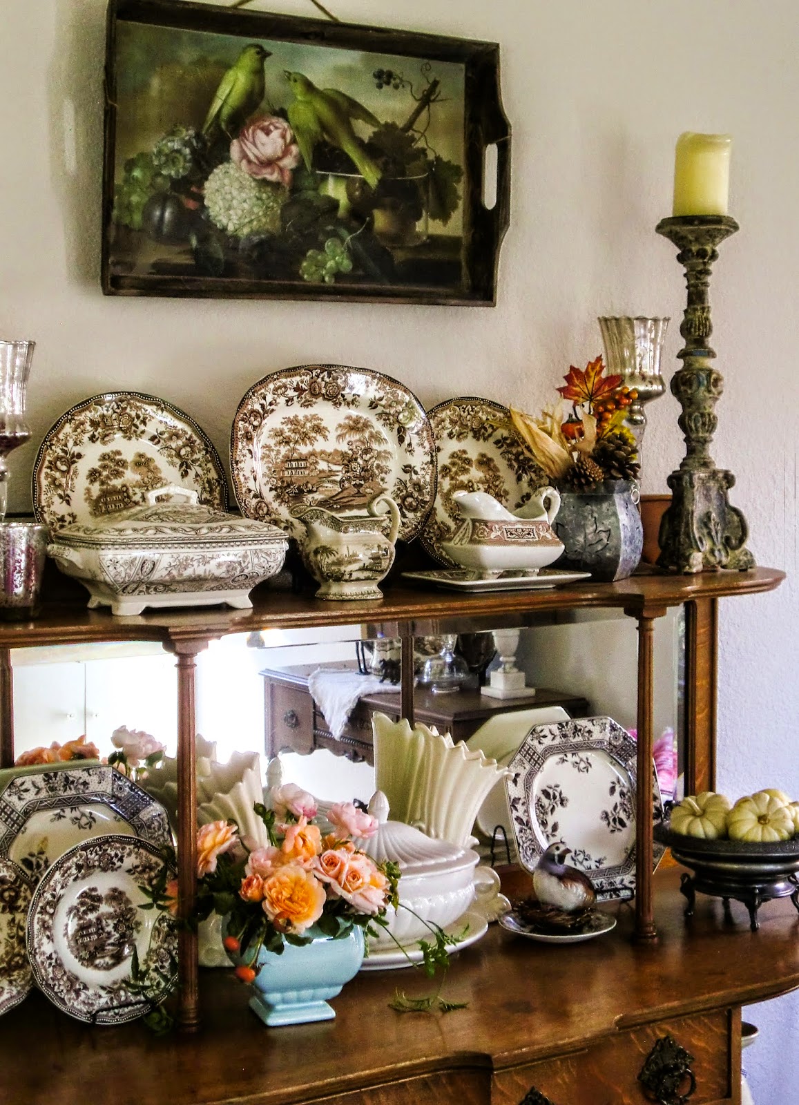
Since getting the initial Tonquin collection, I've added other brown transferware things like this gravy boat and dish.....
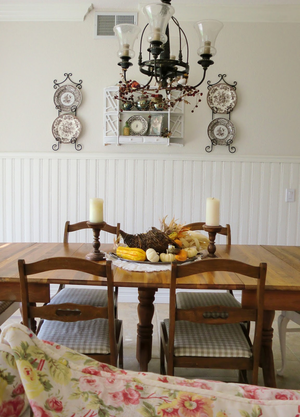
.... and other Royal Staffordshire patterns as well as Spode on the wall.

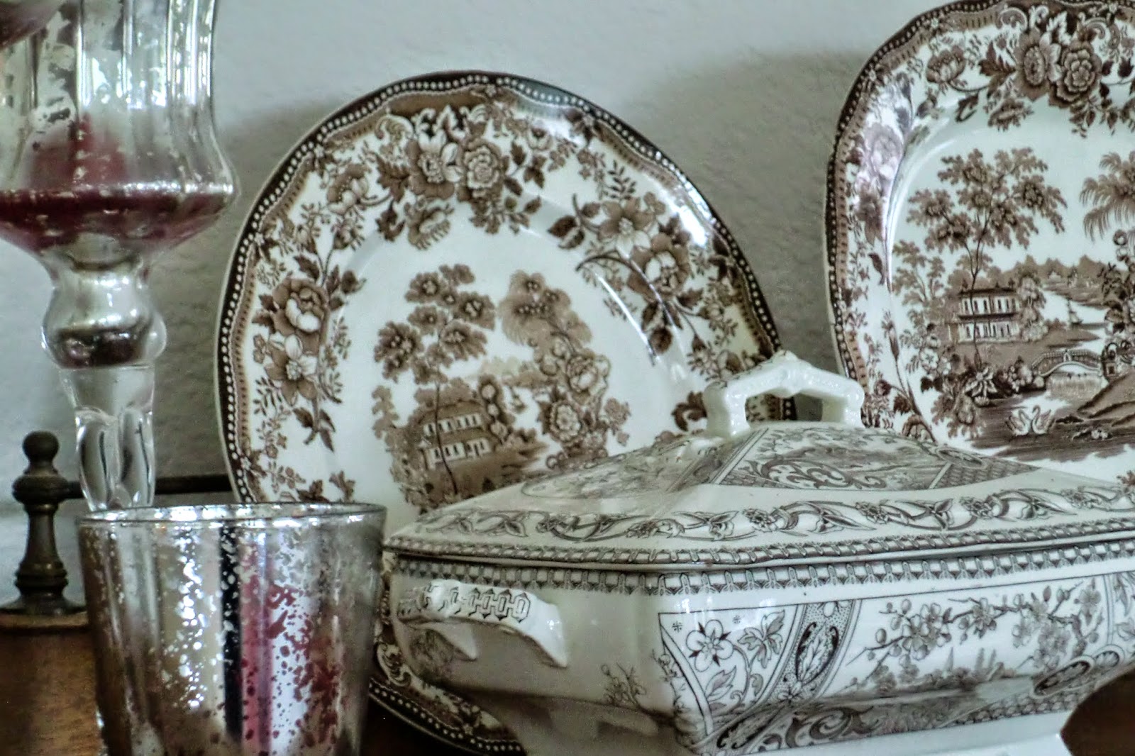
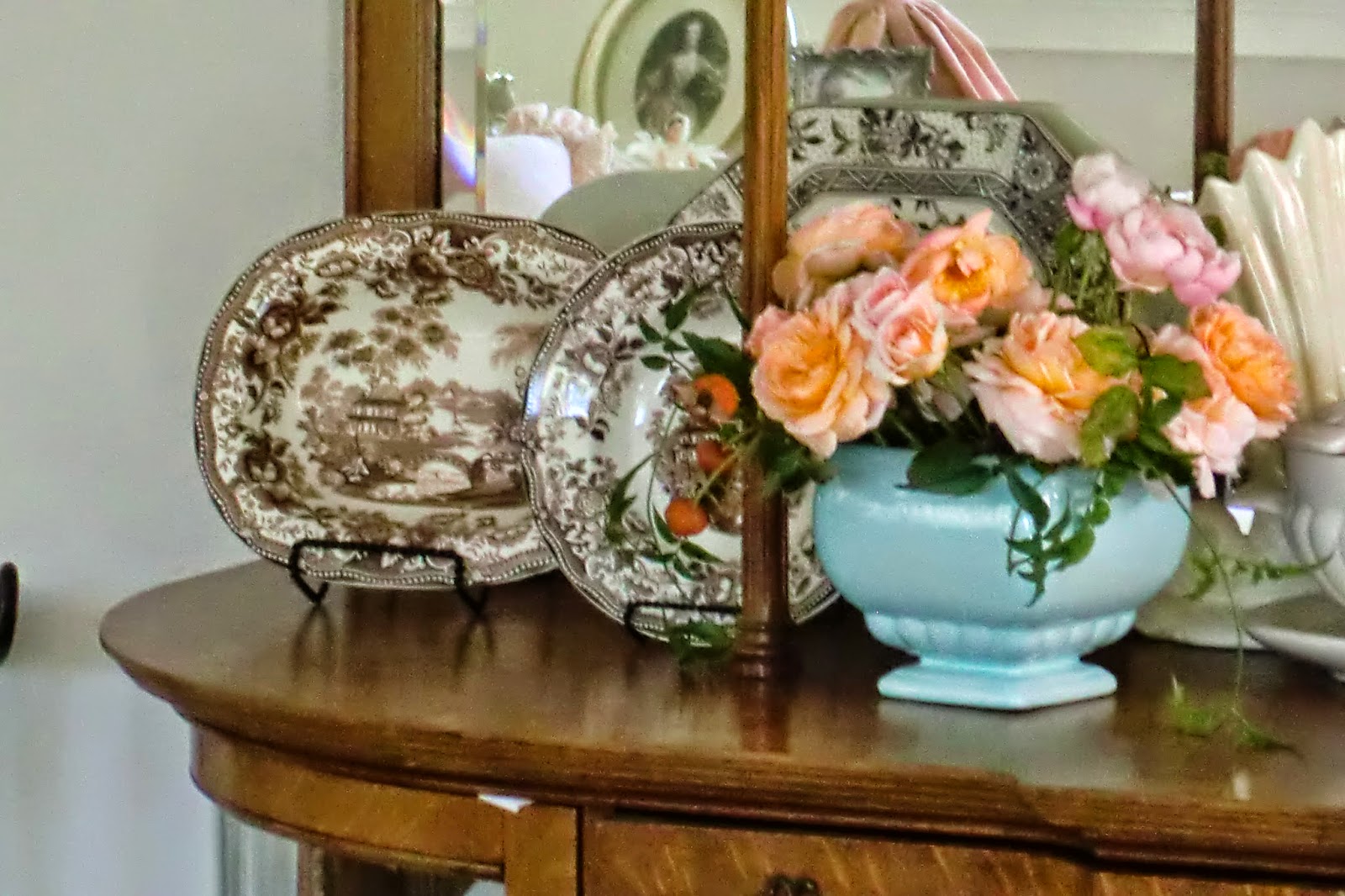
Since the colors in our house tend towards cranberry, raspberry reds and pinks, I avoid the red-brown transferware patterns and go for the darker, more neutral browns.....
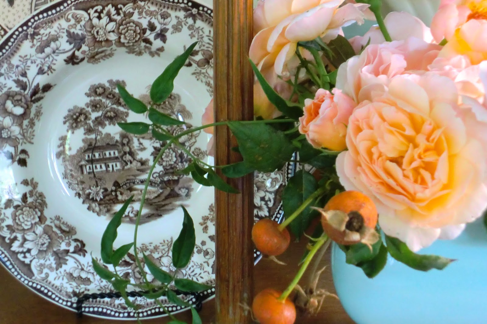
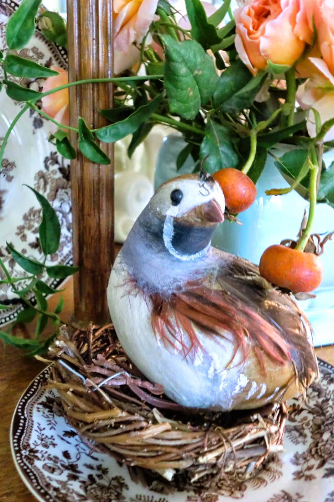
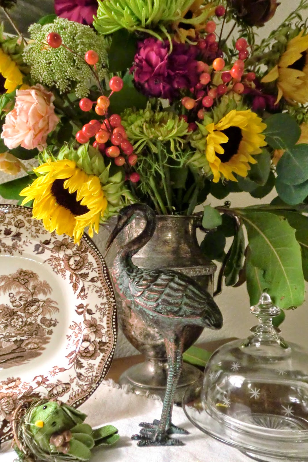
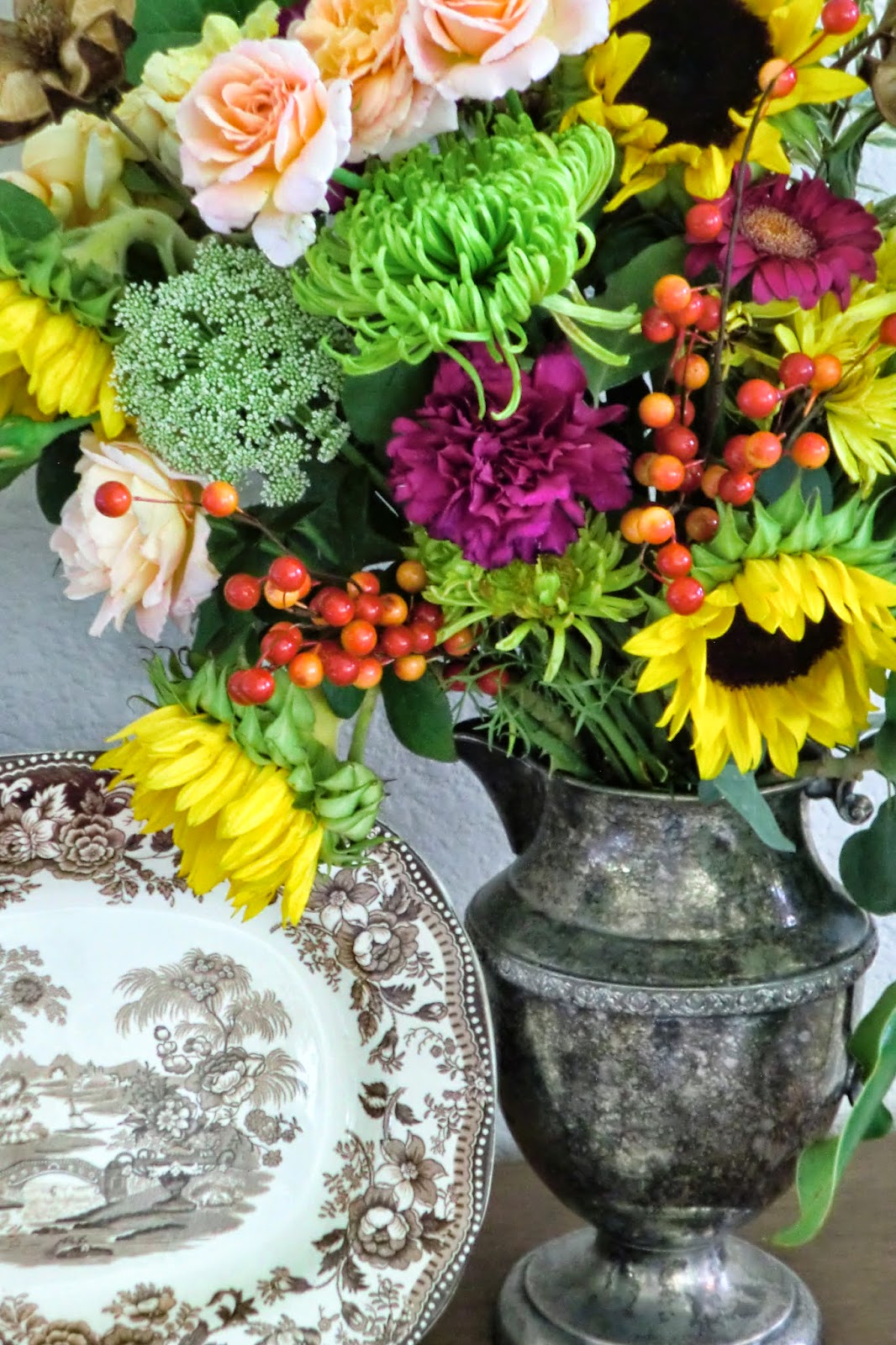
...which I find look pretty fabulous with the dusky pinks and apricots of these 'Evelyn' and 'English Rose' blooms...
...as well as the rest of the colors in our house. I don't worry very much about getting a total match to what I already have. Too much matchy-matchy can look sterile.
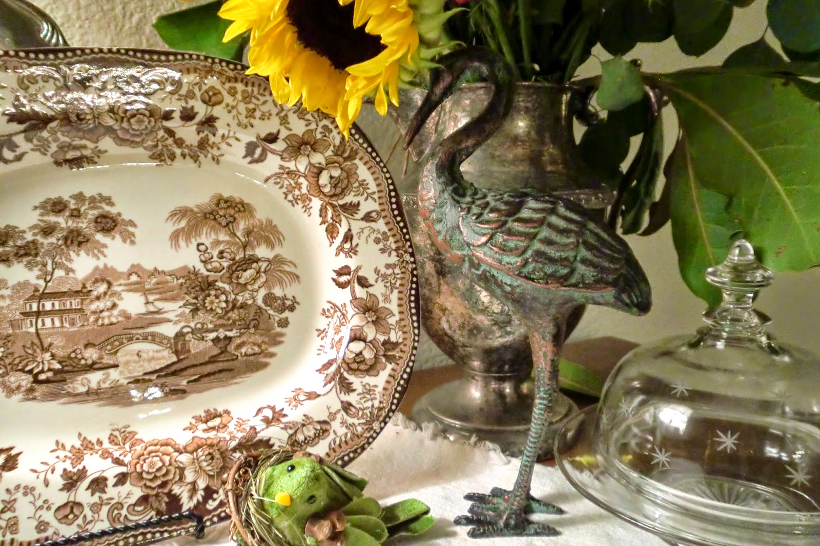
A close-up of one of the serving platters tucked away in the little book-nook on our stairs... for more on how I decorated our stairs this fall, please have a look at this post from a few weeks ago. There is some variation in the colors in this collection-- as you can see, the color in this piece has a more reddish cast.
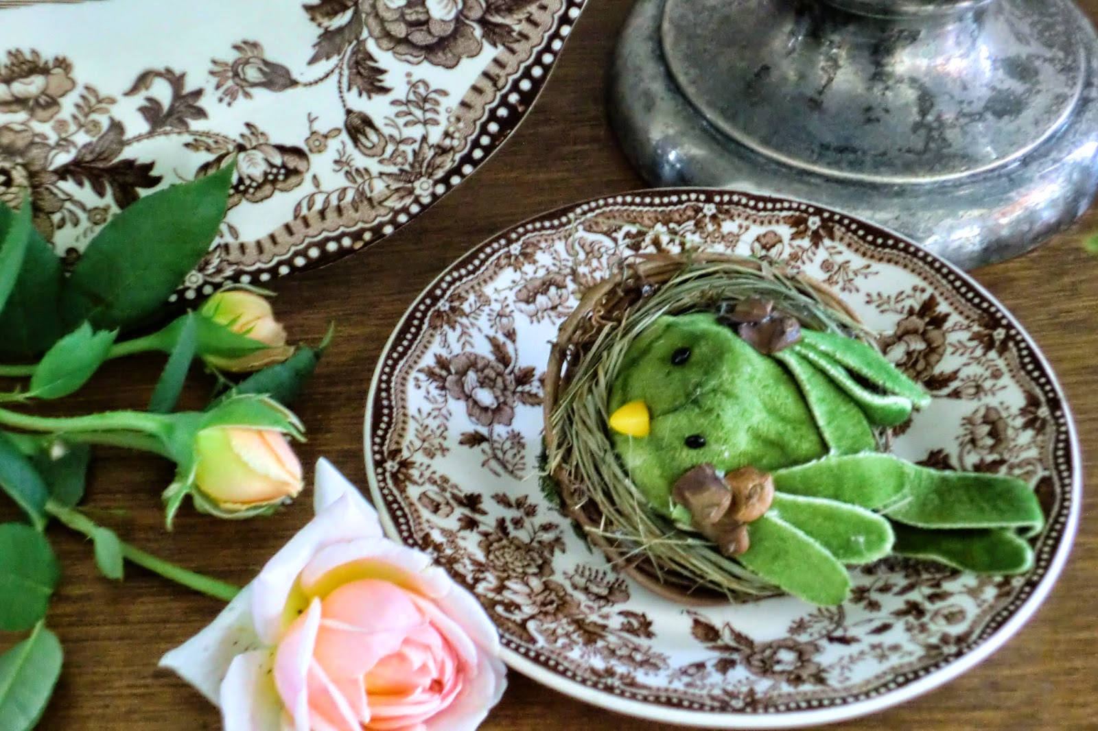
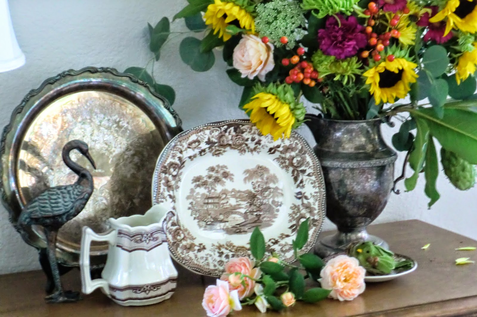
When decorating, I like to use patterns and motifs found in one object in other elements in the room. The fantastical birds and roses on this plate are repeated more or less on the love-seat slip cover...

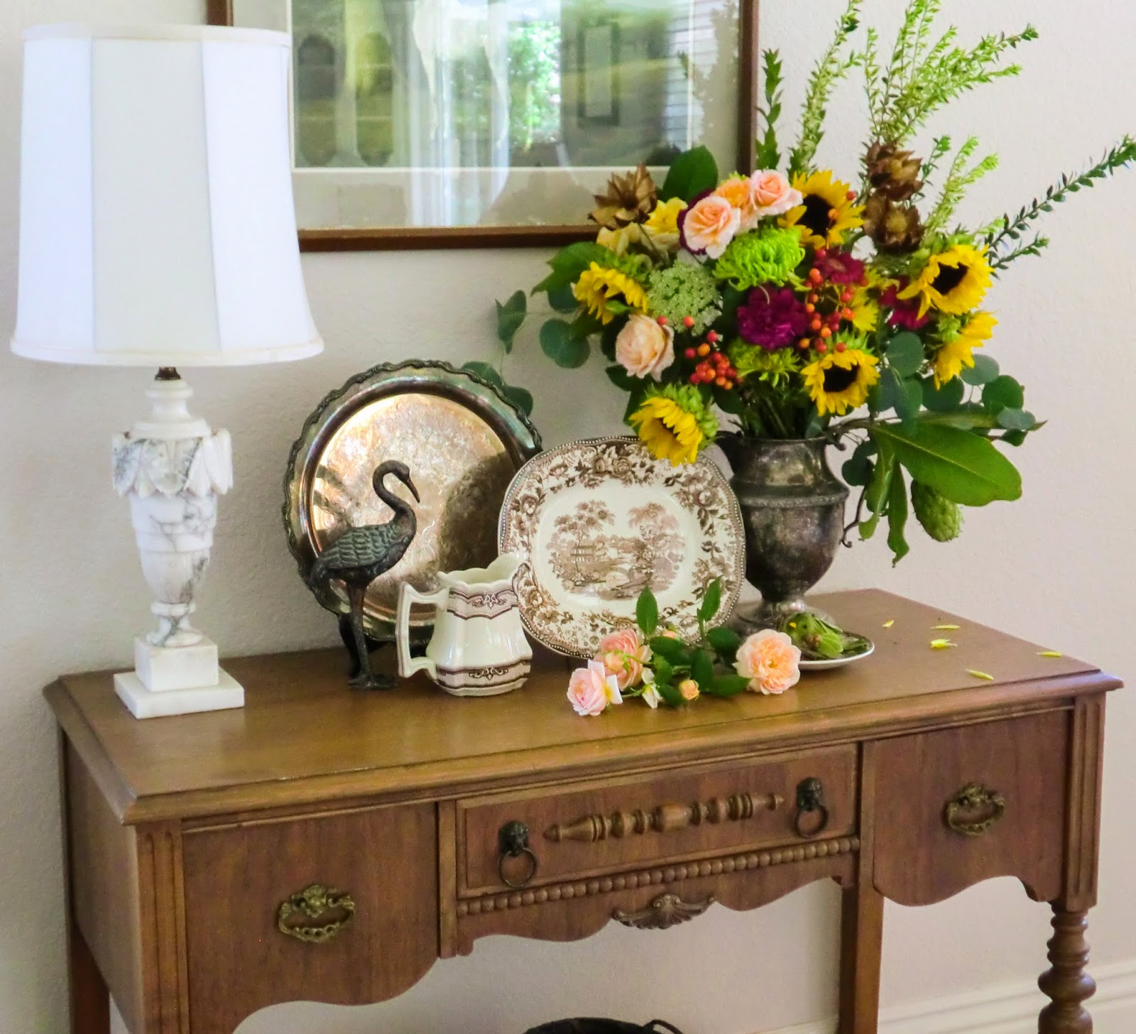
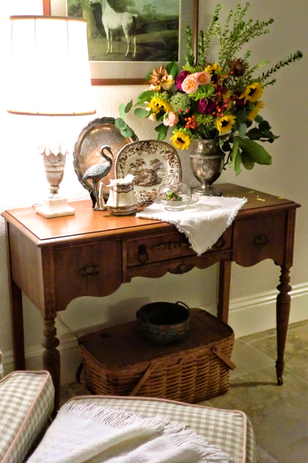
Picking out the apple-greens of the fruit and birds and the pink of the rose in the decorative tray hanging over the sideboard......
and plunking them right down on the little desk that sits catty-corner.....
In fact, throughout this post, you can see an exuberant floral, natural theme in the fabrics, lamp details, pictures on the wall, the ceramic pieces, the flowers, the little creatures. Repeating a motif over and over keeps the eye moving and looking, and creates an interesting, layered look.
Evening light adds a new dimension to all this. I like the contrast between the way things look at night, when colors are more subtle, shadows lend more mystery......

...and in the morning, when everything is fresher and more vibrant.
Happy Fall!
Linking to at Cedar Hill Farmhouse and at French Country Cottage.
BEAUTIFUL...love your style!! Your newest follower...would love for you to stop on by when you have a chance!
ReplyMartina, thank you so much! And thanks for following me-- I had fun exploring Northern Nesting last night (and am now following).